
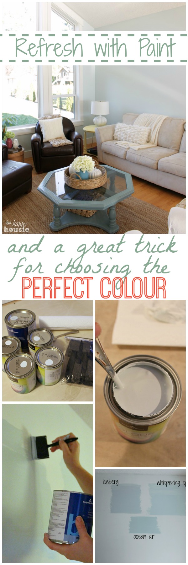
Refreshing the Living Room with Paint {& a great trick for choosing the RIGHT paint colour}
I am sharing a great trick for choosing the right paint colour that I used for my living room refresh.
When we first looked at buying this happy house, it was a little more expensive then we had planned on.
I told my husband that ‘it was perfect’. So perfect that I wouldn’t even need to repaint.
I think that lasted for a good few months. I really held out, if you ask me.
Then it was time. To repaint.
First came the bathrooms.
And the laundry room.
Then our bedroom.
And the hallway.
And now we are completely renovating the kitchen, so we might as well repaint the whole living and dining room while we are at it, right?
But I have to admit to you that more times then I care to admit, I have had to repaint more than once. Within a day.
It can be so hard to make sure that you are choosing the right paint colour for a room.
I admit, I have picked the wrong (VERY WRONG) colour right off the bat and had to go back and buy an entire new can of paint and spend two more coats of time repainting over my original painting mistake.
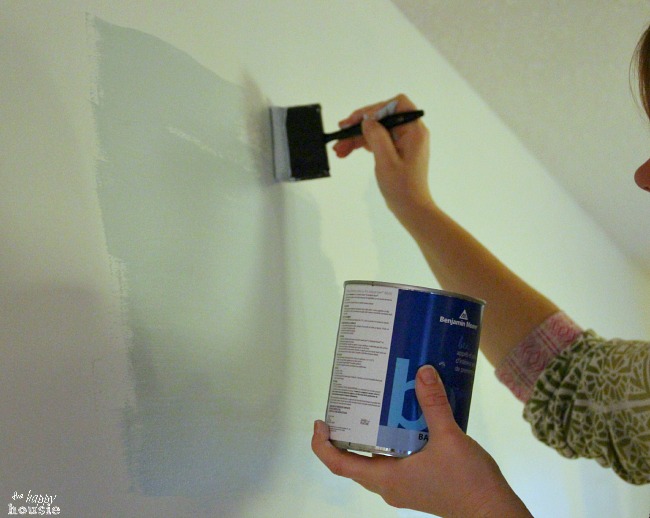
So now, I have changed my tactics. I have started to actually buy those samples that I used to be way too cheap to try out. Here is what I do so that I don’t make paint mistakes anymore.
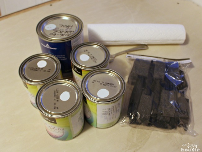
The process is simple. I picked up these sample cans at my local Benjamin Moore store after narrowing down my faves from a ridiculous number of colours. I’m going to be honest with you…we love Ben Moore paints and our whole house is Ben Moore colours. I love the quality of the paint and would highly recommend them to any and everyone. Plus, the inviting colours they offer are stunning.
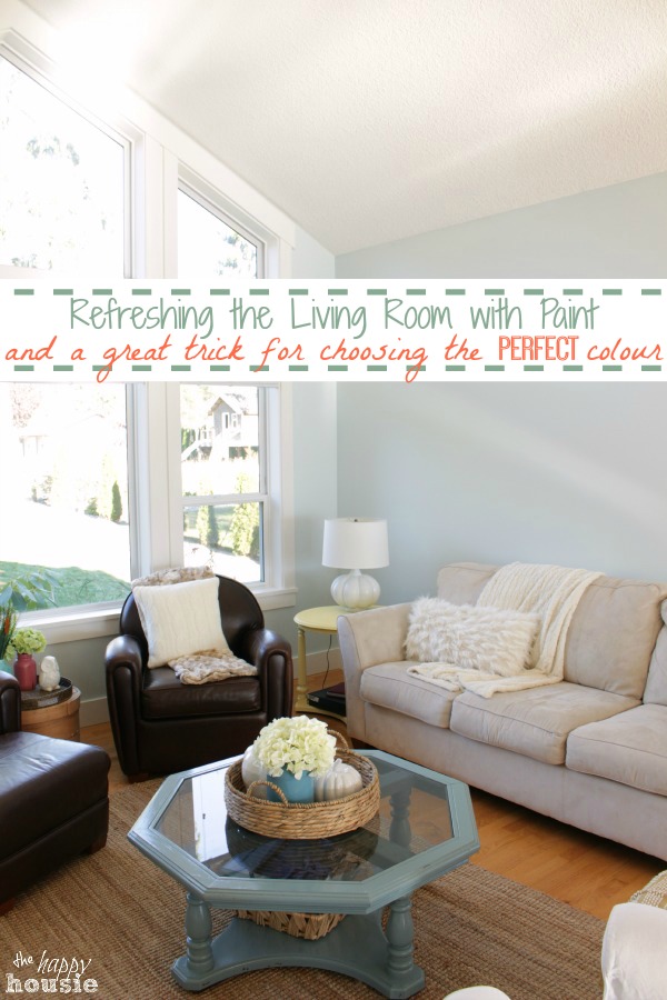
We truly love blue around our house so we knew we wanted to go with a light and airy blue/turquoise tone. I chose to test Iceberg, Whispering Spring, Ocean Air, Palest Pistachio, and Harbour Haze (which I already owned in a larger can).
Foam brushes are a really useful tool for this so that you don’t have to wash a brush between samples (and washing the brush would add water and kind of mess up your paint sample pot anyhow…)
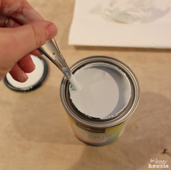
Stir, then paint on with on of your foam brushes….until you get a decent sized square. I had pre-primed the wall beneath where I tested my sample colours so that the colours would show up more ‘truly’ – just painting the samples against our original beige colour would have heavily influenced the way the paint looked and would have been really inaccurate.
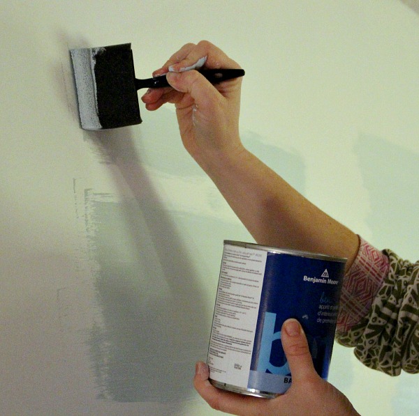
Here is how my paint sample choices looked against my white primed walls….
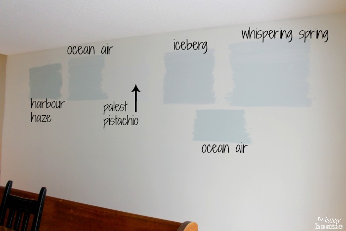
I could tell almost immediately that I liked Whispering Spring, Iceberg, and Ocean Air the best so I decided to do an additional test patch of Ocean Air paint so that I could see it in close proximity to the other two colours. Although it is hard to tell in the pictures, you can see that Iceberg is more of a warm grey, and Ocean Air is a bit darker and has more subtle green tones in it.
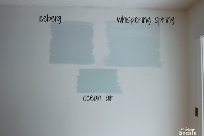
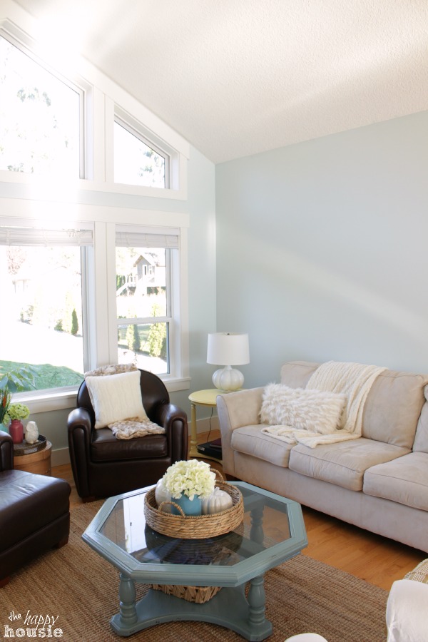
And…. the winner is… Benjamin Moore’s Whispering Spring!!
We decided it was our favourite and painted it throughout the living room, dining room, and kitchen (with a little bit of space left in the dining room and kitchen for some white board and batten). I have to give my husband credit for managing to get way up into those peaks with just an 8 foot stepladder. I wasn’t quite sure how we would manage up there, but he did it!! (PS -he wants me to make sure you know that they are 16 foot peaks;)
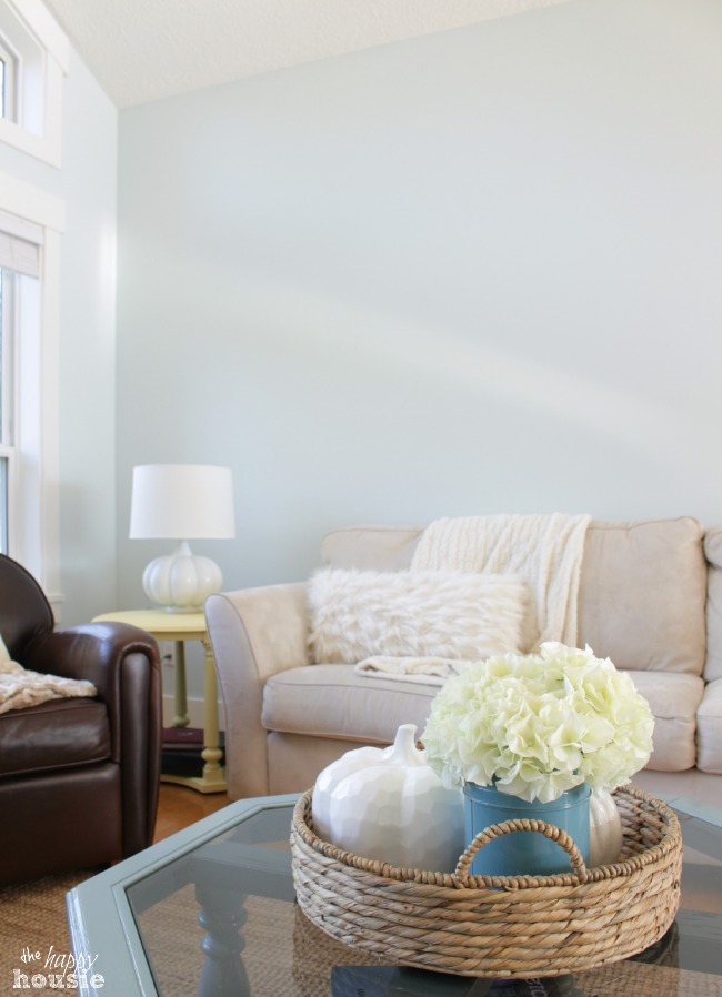
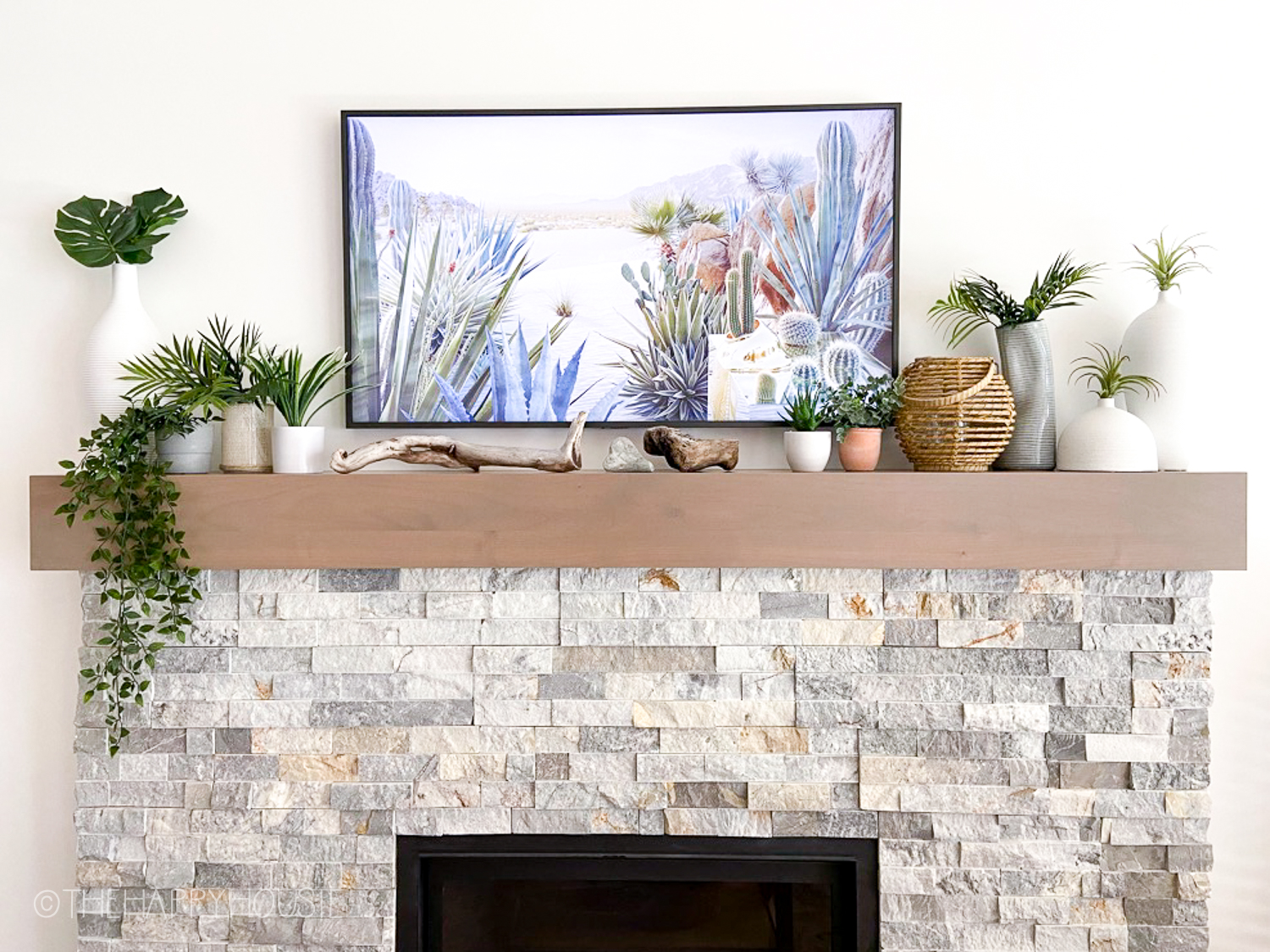
I love the bright, light, airy feel it gives and I really love the way the serene blue works with our natural baskets and sisal woven rug.

How do you make sure you are choosing the perfect colour? Have you ever tried using the sample pots before??

![]()
![]()
![]()
![]()
![]()
![]()
![]()
Disclosure: Benjamin Moore Canada generously provided me with the paint for this project but this is not a sponsored post. All opinions are 100% my own.


So happy I accidentally found your blog. I was trying to chose a color for my dining room and kitchen. Living room is patriotic white, which has blue undertones. Was thing that I wanted something with green undertones for DR&K. Sounds like Ocean Air might be a contender. Thank you.
Thank you for this post. I chose Whispering Spring for my bedroom with Simply White trim and could not be happier. Whispering Spring is such a light, happy color. Your comparisons of paint on the walls helped a lot. Looking into Palladian Blue for dining room and Sea Salt for the living room. Thanks for your help!
I’ve enjoyed reading this blog and love your approach to testing colors. My house was built in 1907. I live in the mid-atlantic with lots of grey days. We’re painting our exterior for the third time in 25+ years. I’ve always used Benjamin Moore paint. I believe it is the best paint with great pigment – my opinion after years of painting. The front of our house faces east. The porch ceiling on these historic houses are traditionally painted a “robins egg blue.” That color can be very tricky depending on other colors used and again, the direction the house faces. I love the Ben Moore Historic color line. They just seen to work best on these old places. That said, they can be on the muddy, grayish side of things depending on how and where they’re used. After a few test spots I chose Whispering Spring for the ceiling! It’s beautiful, soft, and does not compete with my other dominant colors: Wythe Blue (body), Van Deusen Blue (window trim), White sashes and columns and a Garrison Red (door). I’m still in the process but I wanted to cheer on another use for the beautiful Whispering Spring color. Im so happy I read your post and these lovely comments.
I’m looking at Ocean Air for a north facing great room. I was shocked to see how dark your sample colors look on the primed wall. Are those photos really representative? Since it has an LRV of 73.15, I thought it would be lighter and brighter.
Hi Ruth,
My sister-in-law used Ocean Air in her bedroom and it was a very light and bright colour. We used one up – whispering spring – you can see it in our dining room here.
I know this is an older post, but I found you while online searching for paint! Your walls look lovely! I’m helping my daughter pick out paint. I had been looking at Ocean Air, but hadn’t seen Whispering Spring yet. Those are both so pretty, and I’m thinking I will recommend both to her to check out. Her bedroom faces North — Is Whispering Spring a cooler blue? If so, I am thinking that might seem a little chilly in her room. She is only wanting a subtle color, which is why I’m considering the Whispering Spring, as the Ocean Air is a little darker. (It’s going against red oak trim.) Hard to choose though! Thank you!
Hi Krista, you picked a beautiful blue for your living room and it looks great! Thanks for taking time to show the different colors you tested – so helpful. The finished room looks much lighter than the photo of swatches you painted on the wall but maybe that is just a difference in the time of day. May I ask what orientation your living room is (east, west, etc.)? I’ve discovered that getting the right blue for my west-facing bedroom is tricky; so far, all the blues I’ve tried look vaguely grey. Hope you can help.
Hi Jenny, Light can definitely change a colour dramatically, which is why it’s great to try out samples first. Whispering Spring is definitely more blue then grey – but our home faces south and we get quite bright light. In our bedroom we painted a very soft blue called Ocean Air – it is quite lovely as well and has more of a green-blue then grey to it. I hope that helps??
I am trying to pick a living room/dining room/hallway paint color. I have been vascillating between Whispering Spring and Ocean Air. You put both on your “trial” wall. Can you tell me your impressions of both of them? I am pairing whichever color I choose with Paper White which is a soft gray with blue undertones. The Paper White will go in the living room with the other color in the entry way and the dining room. They will butt up against each other in some areas so they need to complement one another. I know nothing about color science. Can you help? I’m going for a light-airy feel. I live in South Florida, by the way.
Hello Kathy,
That is a great question. I’m not familiar with Paper White and when I looked it up I think my computer monitor is altering the colour because it is looking more beige then I think it really is. Anyhow, I will say that Whispering Spring is definitely more to the blue side and Ocean Air is more to the aqua side (has a little more green in it). The other colour I tried with more of a gray undertone was Iceberg – if you are wanting to stay more gray to flow well with the Paper White. Otherwise I would probably be tempted to go with the Ocean Air. Have you done a test wall? It might be worth it so you can be sure – colours react so differently in different lights. Your bright sunshine in South Florida would definitely impact that colour you see compared to our constant grey and foggy weather here:) I hope I’ve helped but perhaps I haven’t! 🙂
I haven’t tested those two particular colors, Whispering Spring and Ocean Air…but I did try out a few others, including the Paper White. I don’t want to spend too much money on samples so I’m trying to be careful and narrow the choices before I buy more of them. I think I’ll go with just one more sample and then decide. It’s so hard because of light and shadows…a color can behave so differently in any space and any time of the day. Thank you for your response.
Picking a paint colour can be tricky. Other colours in the room can throw off the look of your samples. So can your lighting and which way the room faces. Priming over the old paint is the right thing to do. Another idea for doing samples instead of painting directly on the wall, is to buy some of those inexpensive artist canvas boards (at least 16″x16″ in size) and paint the sample on those. This way you can move the sample boards around the room and see what the colour looks like on all the walls and at different times of the day.
I love the colour that you chose and I’ve been considering doing my own living room in blue. Two of the colours I’ve been considering are ones you also tried; Iceberg and Whispering Spring. Thank you for the inspiration 🙂
Hi Debra!
That is great advice – definitely priming first so you have a white backdrop and then being able to move the colour around the room is brilliant as well! We ended up going with Whispering Spring and it is lovely – but I think that Iceberg is gorgeous too ( just a little bit more on the grey side). In our Master Bedroom I used Ocean Air and I love it!. Good luck with your decision!
Ocean Air is a nice pick too! I’m leaning towards the Iceberg, because as you say it leans towards gray. I’m wanting something that goes with Classic Gray that I’m using in the bedrooms.
I love your blog and was pleasantly surprized to read on another post that you are also an Outlander fan!! It just happens to be my favourite series!! Love it!
Oh, I’m an Outlander fan all right. I recently reread the whole series – I had stopped at about #5 just after my second son was born because lack of sleep seemed to be interfering with my reading comprehension (imagine that?!). But I started up again just over a year ago and whipped through all eight of them. I wonder how long until the next instalment… It’s hard to wait!
May I add a bonus tip? Lighting on the different walls of the room varies a lot and can affect your color choice. I always do the paint patch testing like you, but I also do it on one or two opposing walls to see what the color looks like in the varied lighting. That way there are no surprises. 🙂
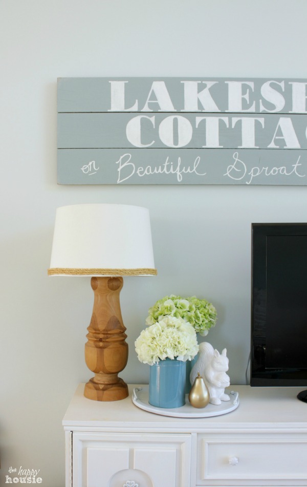
WOW I love this!! I am definitely pinning it! I also love your lake sign! I just found your blog, did you make that sign too? We are building a new house next year, and this is a color I think we will use in our living room! So happy I found your blog! 🙂 You should join me on Tuesdays for the Celebrate Southern link up I host over at http://www.2catsandchloe.com for some southern-inspired posts. You don’t have to be a southern blogger to join, this post would be a perfect fit! 🙂
Wow, the colour looks great with your decor, darling! Love it!
Hugs, Jamie
It is a GORGEOUS color, Krista! So fresh and pretty!
I am SO in love with that color. Your method is obviously a good one because you definitely picked the perfect color!!
Beautiful job, Krista! The color you picked is perfect!!
~Abby =)
I love, love, love the color! It makes all your decor pop!